The app that makes managing your home easy

Home+ is a user-friendly mobile application designed to simplify home management. With this product, you can effortlessly handle chores, manage utilities, schedule maintenance, coordinate renovations, connect with trustworthy tradespeople, enhance safety measures, secure utilities at competitive rates, and even earn rewards for your engagement. We provided critical analysis and design workshops, which were used to provide innovative feature solutions and an easily-understandable design system.

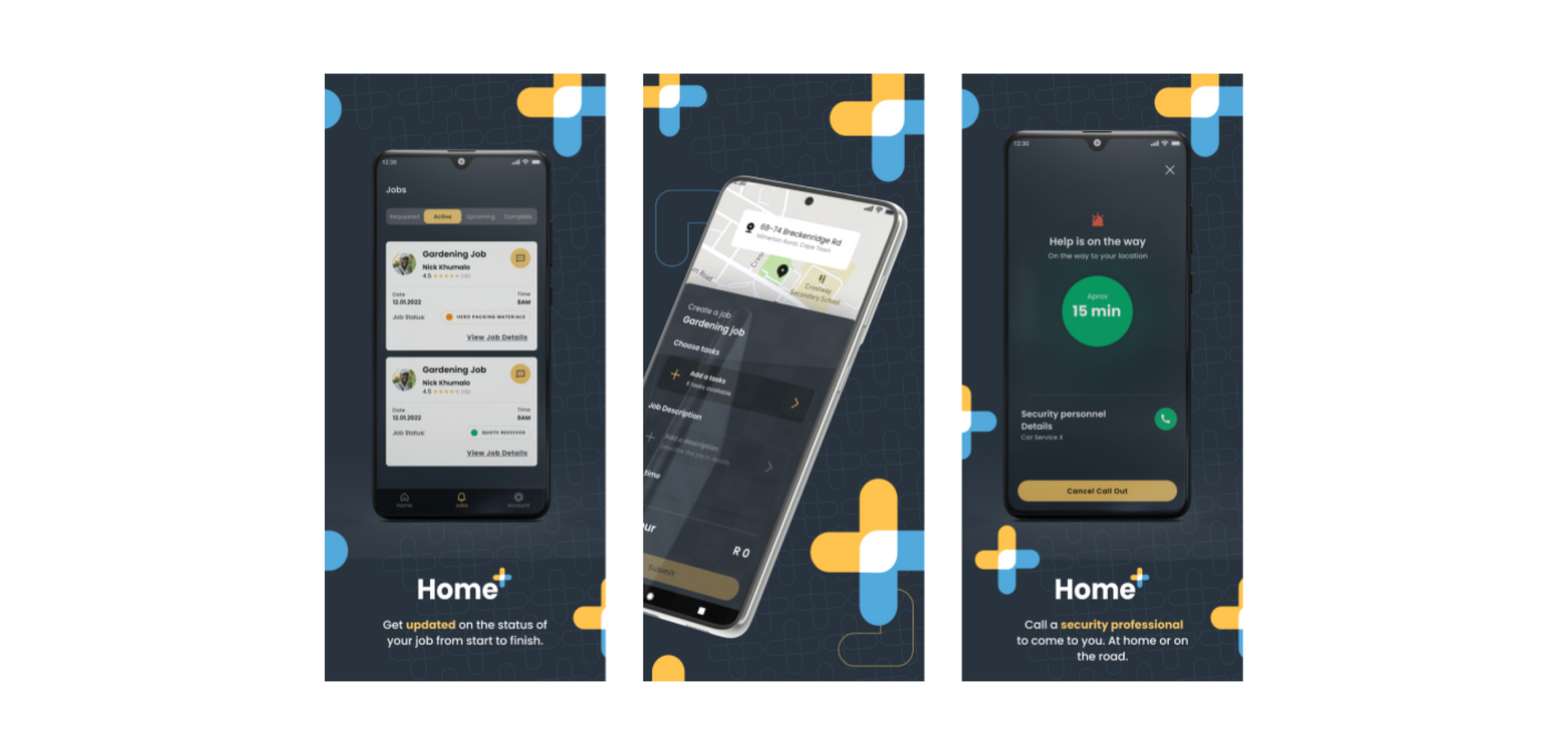
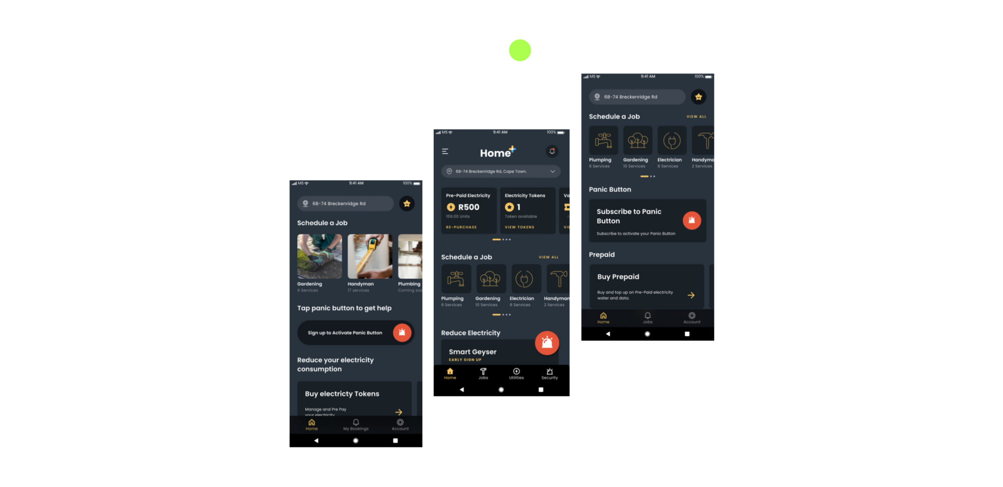
The app has three key features. Firstly, it connects users with certified tradespeople, enabling direct bookings for various services such as plumbing or electrical work. Users can conveniently track the progress of their tradesperson, similar to tracking a delivery on Uber Eats. All quotations and payments are seamlessly handled within the app.
The second feature offers prepaid electricity purchases with an attached rewards system. Users earn tokens by spending R500 on electricity purchases, which can be used to play a coin flip game. Each flip guarantees a discount on the next prepaid electricity purchase.
The third feature is a subscription-based panic button service. For a monthly fee, users gain access to a panic button that can be pressed in any emergency situation, regardless of their location. The app aims to manage all household needs within a single platform.
The Challenges
As we embarked on the project, we quickly became aware of the challenges that lay ahead of us. Initially, we were assigned the task of implementing design updates only and ensuring their timely completion (as we all know, time is often of the essence). This seemed straightforward enough, but pretty soon, the actual challenges began to emerge. The expectations needed a lot of refinement to achieve a state where we could action them. It wasn't always clear who to liaise with. There was no clear path forward to help our clients realise their vision; it was up to us to blaze the trail.
We resolved to forge ahead. However, it became evident that certain limitations within the team dynamic were preventing us from delivering a superior product:
Firstly, the team already had international designers tasked with designing for a local demographic. The copywriting within the application was overly formal, so the product catered predominantly to an international audience when it should have focused on the local audience.
Secondly, although testing was conducted, our team of designers could not access any substantial data resulting from these tests. Furthermore, the testing was not conducted within the local market, thereby further impeding our ability to adequately address the needs and preferences of our target users.
Thirdly, the existing organisational processes did not allow a lot of open communication, at least not to the extent that we were used to at Retro Rabbit. This lack of effective communication hindered our ability to collaborate and synergise with team members, ultimately impeding the overall progress of the project.
We found ourselves in a situation where various stakeholders were dictating the direction of the app without the support of user-driven data. This misalignment between stakeholder interests and user needs created a sense of chaos and discord within the team, which hindered our ability to work cohesively towards a shared goal.

Solutions
We had a stroke of luck — the lead designer at that time transitioned out of the project, which allowed us to add another of our own to the team. This was a golden opportunity. We took the lead and set up some expectations of a more collaborative environment, and highlighted the importance of having structures and processes in place.
Rather than solely fixating on completing the design tasks, we could now place equal importance on establishing robust frameworks. We were able to solve the high-level culture and process problems that we identified, and could now wholeheartedly immerse ourselves in the work at hand.
In order to adhere to the given timeline for the product launch, we found it necessary to establish a solid foundation within our team by defining our working methods and determining the design process to follow. After conducting thorough research, we took the lead in organising workshops aimed at establishing a shared understanding of our "Definition of Ready" and "Definition of Done" as a team. These workshops played a crucial role in managing expectations and aligning our vision for the app with the immediate priorities required to meet our deadline for going live.
Remarkably, we even engaged executives in these sessions, which not only added a sense of enjoyment but also fostered a shared commitment to the project's success. While we acknowledged that such workshops might occasionally divert our focus from immediate tasks, we ensured that all valuable ideas and suggestions were duly recorded, resulting in the creation of a comprehensive feature and suggestion list.
A New Title
Due to the substantial workload involved, encompassing not only the app but also the broader product perspective, our roles started to spill outside the lines of UX & UI Designers. This is when we were dubbed as Product Designers.
What exactly sets these roles apart? A UX & UI designer primarily directs their focus towards the individual feature or app, whereas a product designer adopts a more comprehensive approach, considering the entire product journey. This journey commences from the user's initial introduction to the product, be it through social media or advertising, and extends all the way to the attainment of their desired objectives. A product designer also takes proactive measures to ensure user retention, aiming to establish a long relationship. A product designer's scope encompasses the complete user experience with the product.
The Results
With a new title and perspective, we implemented a structured framework, including defined processes and an excellent design system. This enabled us to prioritise valuable user feedback and transform it into exceptional designs that resonated with our users, ensuring they felt heard and understood.
As a team, we accomplished significant milestones within a short timeframe. In just 8 months, we successfully launched a fully functional app for South African users to utilise and enjoy. Witnessing our app being live on the app store and in the hands of users is truly rewarding.
After the successful launch, we dedicated our attention to refining and enhancing the user experience within the existing app features. As emphasised throughout this journey, we prioritised establishing a solid foundation before expanding further. This adventure naturally presented its fair share of challenges and moments of exhaustion. Nevertheless, the experience proved immensely gratifying and fulfilling.
