Ducks, Daisies, Development, and Design: The Unbland Blandford Manor
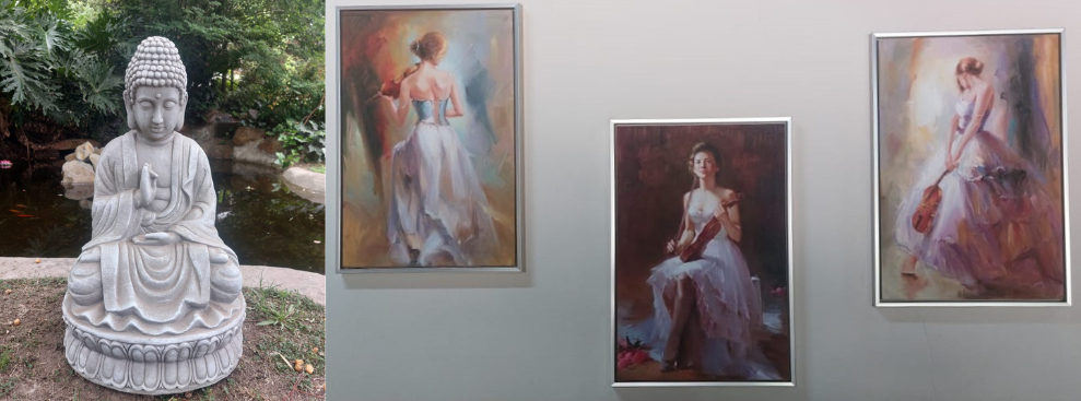
The UX SA Conference 2024 at Blandford Manor offered a refreshing blend of intellectual depth, humor, and nature’s tranquil beauty. As ducks waddled beside beds of golden daisies and under leafy canopies, industry leaders waxed philosophical about UX design, one couldn’t help but feel that these organic surroundings offered the perfect counterbalance to the digital world we inhabit. With wit, wisdom, and a touch of irreverence, each speaker took us on a journey through the fascinating, sometimes frustrating, world of user experience.

Day 1: Forms, Friction, and Philosophy
Schalk Venter - Forms and Design Philosophy
Schalk Venter kicked off the conference with a bold declaration that 60% of software is just forms—and let’s be honest, filling out forms isn’t exactly exhilarating. Referencing design expert Luke Wroblewski, Venter described forms as anxiety-inducing, almost like facing down a small existential crisis every time a text box appears. His solution? Reduce friction, make forms intuitive, and, above all, embrace what he called “boring design.” Sometimes, the best approach is to keep things simple, leveraging semiotic inheritance—relying on familiar symbols and formats to ease user interactions.
Venter also touched on Jacob’s Law, the notion that users spend most of their time on other applications, so it’s smart to make your designs align with what they already know. He discussed leaky abstractions, highlighting that AI and other tools can help in the creative process but shouldn’t be mistaken for complete solutions. His advice: use tools as assistants, not shortcuts to innovation.

Day 2: Front-End Feats and Accessible Futures
Schalk Venter - The Future of UI Animation
Venter returned to present a more whimsical view on UI animation, exploring intrinsic design principles and CSS View Transitions. He demonstrated how these tools can inject a little magic into digital experiences without hampering performance, akin to watching ducks glide seamlessly across the manor’s hidden lake. Venter’s key takeaway? Keep it smooth, and keep it simple—much like nature itself.
Ebbie Swart and Stephen Swart - Birding Apps and Reverse Engineering
Ebbie and Stephen Swart brought a different flavor to the conference with Firefinch, a birding app developed using Reverse Engineered Hypothesis Design. They illustrated how starting from the user’s problem rather than a preset solution helps you arrive at better designs. Introducing the idea of Design Kata, the Swarts suggested that practicing design with clear end goals in mind can improve one’s skills over time. A philosophy as relevant to app design as it is to birdwatching.
Panel Discussion - Embracing Failure and the Humanity in UX
A spirited panel discussion on the role of artifacts in UX design saw experts exploring everything from wireframes to paper prototypes. The panelists discussed how embracing failure is crucial in design, as every misstep can lead to a deeper understanding of user needs. They emphasized the courage needed to challenge assumptions, build a tolerance for being wrong, and, perhaps most importantly, to bring humanity back to UX. Design is not just about functionality but about creating experiences that resonate with people.
They also discussed balancing low and high-fidelity prototypes, reminding everyone not to get attached to ideals but instead focus on solving real problems. Their takeaway: sometimes, a rough sketch can communicate just as well as a polished mock-up. A friendly debate ensued on the point at which artifacts (like wireframes) become more of a hindrance than a help—a gentle reminder not to let the tools outshine the vision.
Lucky Nkosi - Accessibility by Design
Lucky Nkosi’s talk was a masterclass in designing with accessibility in mind. He started by affirming that everyone should be part of the SDLC (Software Development Life Cycle), meaning accessibility should be a shared responsibility. Lucky introduced tools like WCAG, Wave, Lighthouse, and Ax Dev Tools, and frameworks like Pa11y CI, which can automate accessibility testing before development.
Lucky’s key message: accessibility isn’t just about learning new tricks, but understanding what not to do. By proactively addressing accessibility challenges during design, we create products that are inclusive from the ground up. His candid advice: accessibility is about building a world where everyone feels they belong, even if they’re interacting with a screen.
Brandon Tancott - No-Code/Low-Code: The Future of Democratized Development
Brandon Tancott rounded out the conference with an enlightening dive into No-Code and Low-Code development. No-Code, he said, was perfect for simpler applications—think workflow automation or business process management—while Low-Code allowed for a bit more customization. Both approaches help democratize development, making it accessible to those without extensive coding skills.
However, Brandon didn’t shy away from the trade-offs. With No-Code and Low-Code, customization is limited, and scalability and security can be concerns. He illustrated the landscape of tools like Webflow, Bubble, and Figma to Webflow integration and highlighted the importance of finding the right balance between ease and power in development. His parting wisdom: “Balance is the secret sauce.” Like finding the right blend of water, sunlight, and soil for daisies, building apps needs a delicate mix of ease and control.

Day 3: Zen and the Art of User Experience
Sivan Lapidas - Absa ChatWallet and Creative Friction
Day three began with Sivan Lapidas’s presentation on the Absa Wallet, a mobile banking solution embedded in WhatsApp. Lapidas outlined how the wallet, which supports interbank payments as low as R1, went from concept to launch in just two years. With a twinkle in her eye, she described “creative friction”—that delightful tension that drives innovation—and how it led the team to solutions they hadn’t anticipated. The Absa Wallet was created to solve the wicked problem of granting accessibility to underprivileged communities, making banking services more inclusive and bridging financial gaps. This groundbreaking project went on to win the Global Service Design Awards, underscoring that good design is as much about embracing the unknown as it is about solving known problems.
Alfa Oloo - Designers Guide to Surviving the AI Wave
In a session that combined neuroscience with design, Alfa Oloo tackled the anxieties that come with a rapidly changing industry. He spoke of the amygdala hijack, a powerful emotional reaction to change, and explained how designers can navigate this fear by seeing AI as a tool, not a threat. He drew an amusing parallel to librarians who weathered the arrival of the internet, suggesting that designers, too, will adapt as AI becomes a bigger part of their workflow. The bottom line: adapt, don’t panic.
Barend Chamberlain - Talk about talking about Accessibility
Barend Chamberlain emphasized the importance of empathy in accessibility. Rather than just focusing on what accessibility entails, he encouraged designers to think about how they talk about it. “opening our eyes to color blindness” (pun unintended but appreciated), he advocated for more meaningful conversations around disabilities. His talk was a reminder that poor accessibility practices aren’t just inconvenient—they can lead to lawsuits. The moral? Accessibility is not just a checkbox; it’s a commitment to inclusivity.
Cera Aerts & Gideon Carstens (Sanlam) - Naming is Hard
In a surprisingly philosophical discussion on naming conventions, Sanlam’s team delved into the intricacies of Atomic Design in Design Systems. They highlighted how tokens support maintainability, scalability, and collaboration, emphasizing that tokens are not mere labels but the product of crucial architectural choices. The key takeaway: names may seem trivial, yet they play a vital role in building cohesive, efficient systems. Tokens serve as foundational elements that unify the entire design system.
UX Panel - The Evolution of UX: A Decade in Retrospect
A reflective panel capped off the conference, where speakers pondered how UX has evolved over the past ten years. UX has matured, they noted, with designers becoming more embedded in development, education on the rise, and accessibility front and center. The panel celebrated the emergence of the design entrepreneur, who doesn’t just design interfaces but shapes entire products and solutions. With protocols and principles improving, the panelists looked forward to a future where UX doesn’t just cater to today’s users but anticipates the needs of the next generation.
Closing Thoughts
As the UX SA Conference wrapped up at Blandford Manor, attendees left with a renewed appreciation for the intersection of nature and design, simplicity and complexity. The conference reminded us that the best experiences—whether in the digital world or among ducks and daisies—are those that feel seamless and human. Each speaker’s message resonated with the idea that good design, much like a well-tended garden, requires patience, empathy, and a willingness to get a little dirt under the fingernails.
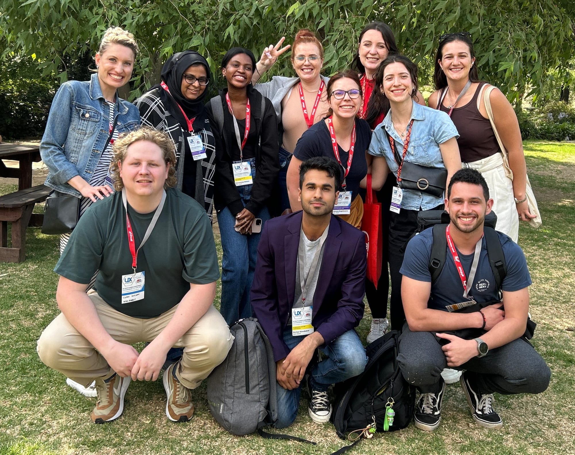
A special thank you to Schalk Venter and Ighsaan Robinson for making the event such a success.

