My Life as a Corporate Designer
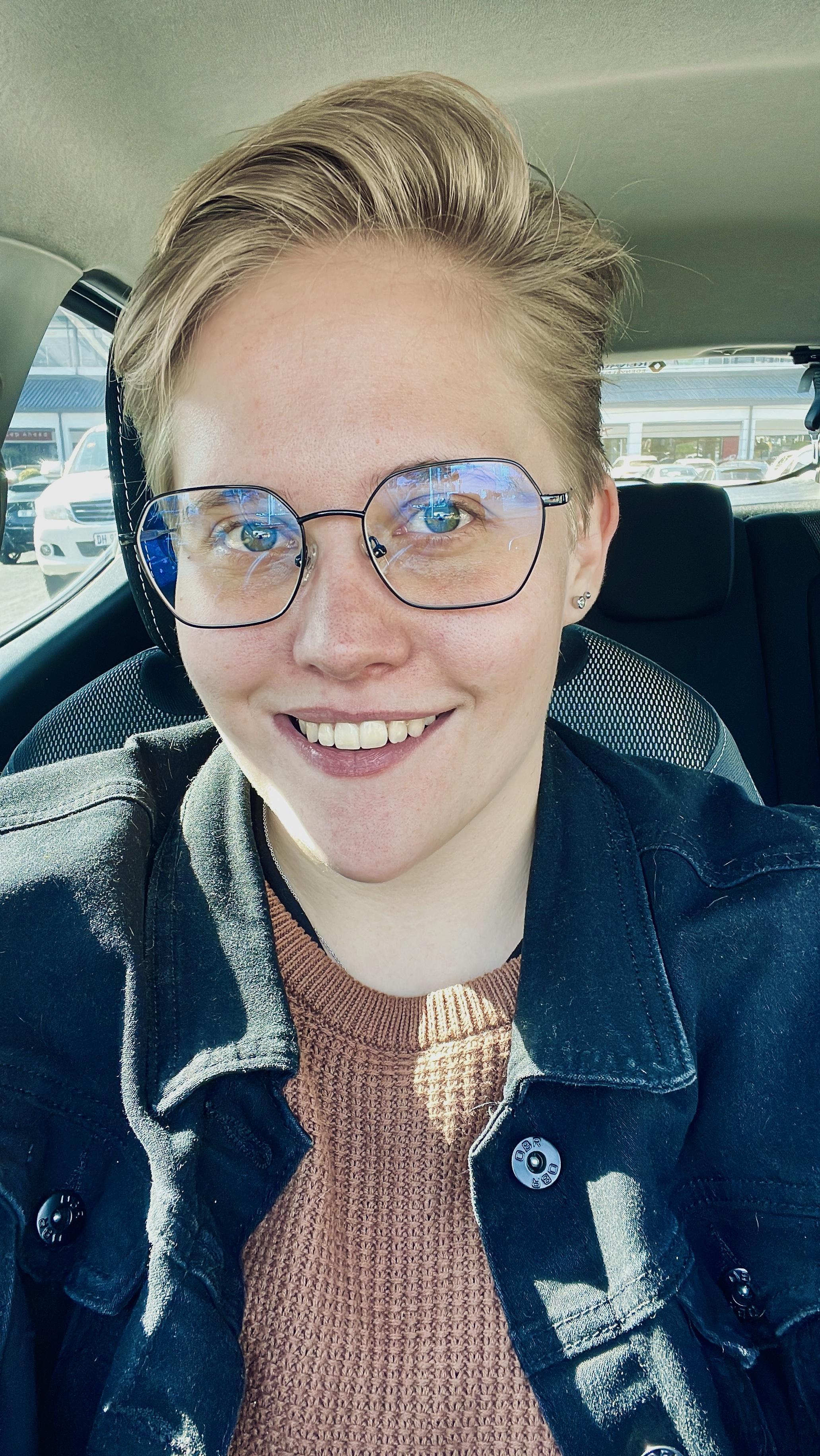
I am a year into my career and never in a million years would I have expected to be where I am now. Do you ever remember your teachers telling you that one day there would be jobs that you have never heard about? Well I feel like I am now in one of those jobs. My name is Tammy Craggs and I am a UI/UX designer at Retro Rabbit. A year ago, I was a part of the 2022 grad program where I spent 3 months learning the ins and outs of the industry and working alongside my fellow designers and some curious developers. The excitement of completing my first ever team project was overwhelming and the sense of accomplishment that followed the presentation of my inflight infotainment system was exhilarating. But the anticipation of finally being placed at a client was incomprehensible. Fast forward, and I am now placed at one of the biggest banks in South Africa where I design chatbots for a living.
As a new designer to the industry I truly didn’t know what to expect, but I was definitely looking at the situation through rose coloured glasses. I think a big part of me had very high hopes for going into industry because of how I was taught to design products during my studies. When you design a product in university you are given the luxury of designing the full end to end product. This includes everything from research and considering your users, to the final prototyped user interface design. You are also isolated in your own little design bubble with absolutely no influence of developers, therefore there was very little thought involved in how the product would be built and if it would have a life after the design phase. I thought that things would work similarly in the industry, but even in those very first few weeks in the grad program, I quickly realised that this may not be the case.
At the bank, the team I work on is made up of a product owner, a business analyst, four developers, and then me working as their UI/UX designer. My main role in the team is to create various conversation flows for different departments and countries. Therefore, my day to day life is very much concerned with how the Bank’s customers will interact with the chatbots in order to gain valuable information or even to submit documentation. Each stakeholder has their own goal for the use of a chatbot as an additional digital platform into their digital ecosystem and as a team we strive to make their dreams a reality.
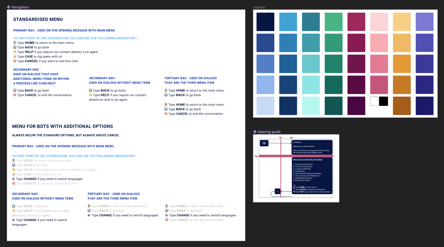
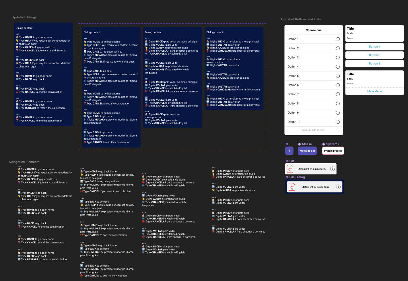
In order to standardise the ways in which I create these flows, I have implemented a couple design methods into my daily approach that has created consistency across the various chatbots. Firstly, even though it is seemingly non-traditional, I created a design system for all the elements that I use when creating the conversation flows. Everything from the arrows, to the colours, to the different types of dialogues, have all been created as set components. This has made creating, updating, and maintaining our Figma flows more efficient.

Additionally, as a team we hold daily testing sessions where we are able to view whether the chatbot is functioning and I am able to double check how the user experience feels when it has been fully implemented in our development environment. It arose in one of these sessions that we had an inconsistent use of navigation and that there was no commonality between the different chatbots. In order to combat this, I created a second version of the design system which now included updated dialogues and a set hierarchy of navigation. Therefore, by just creating a few variants and some design rules, I can now toggle the navigation on and off depending on whether the dialogue is a menu, the beginning or end of a process, or just text based content. This enabled the design side of things to become more standardised and consistent which then had a ripple effect that resulted in the development team also creating a set of reusable navigation components. Consequently creating an alignment across the entire team and improving the user experience of our chatbots.

Despite my role existing more on the user experience side of things with a clear focus on conversational user interaction, I am still able to use my more traditional design skills in some unique ways. I create video walkthroughs on Figma of each chatbot that goes live. These videos are often instructional and help our stakeholders understand the use of their chatbots and they also serve as good internal marketing material as the videos highlight key features and functionality that the team is able to build out. These videos are a key area where I allow my creativity to escape and with the power of smart animation I am able to create engaging and eye catching content.
As mentioned earlier, I never expected to be where I am now. The life as a designer in a corporate environment is very different to the expectations I first had. I have realised over the course of this year that despite the fact that I am a solo designer, the work that I do cannot be done in my own isolated bubble like it once was in university. A good working relationship is essential between me and all of the team members as we all work towards one goal and we either win together or lose together. Overall, I believe that interaction design does not look the same for everyone and in every environment, but having the flexibility to adapt is essential to being a successful designer.
